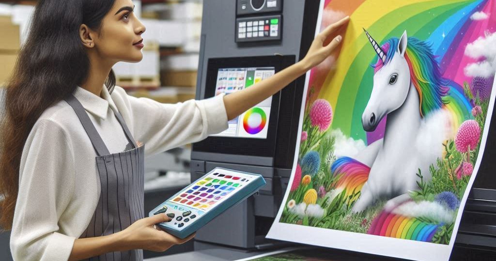

Ever ordered a shirt online, only to have it arrive looking completely different than the picture? The culprit might be something called “color management.” It’s the process of ensuring colors appear consistent throughout the printing process, from your computer screen to the final product.
What is Color Management?
It ensures that colors look consistent across different devices and media, such as computer screens, printers, and paper.
Why is Color Management Important?
Imagine a recipe – different kitchens might use slightly different ingredients or cooking methods, leading to variations in the final dish.
Similarly, printers use various inks and papers, affecting how colors appear. Color management bridges this gap, ensuring consistency between your design and the printed result.
Here’s why color management is a big deal in the printing world:
- Accuracy is Key: Professional printing relies on precise color reproduction. Imagine a brochure with faded photos or a business card with washed-out logos. Color management eliminates these mishaps.
- Happy Customers, Happy Business: Nobody wants a disappointing print job. Consistent, accurate colors mean satisfied customers who keep coming back for more.
- Saves Time and Money: Color misprints waste time and money. Color management avoids costly reprints and ensures you get what you ordered the first time.
Here are some other reasons why color management is crucial for printing:
- Seeing is Believing: Imagine picking out clothes online, only to have them arrive in a completely different color! Color management in printing makes sure what you see on screen (like a photo in a brochure) matches the final printed product exactly.
- Brand Power: Colors are a big part of a brand’s identity. Think of the red of Coca-Cola or the yellow of McDonald’s fries. Color management ensures your brand colors are always printed accurately, so your customers recognize you instantly.
- No More Print Nightmares: Ever get a business card where the text is hard to read because the colors are too close? Color management avoids these printing disasters. It keeps colors clear and vibrant, making your prints look professional and polished.
How Does Color Management Work?
Think of it like a translator for the printing process. Here’s a simplified breakdown:
- Design on Screen: You design your project using specific colors on your computer.
- Color Profile Conversion: Software translates those computer colors into a language printers understand.
- Digital Preview: This process allows you to see how colors will look when printed by simulating the print on your screen. It helps make necessary adjustments before actual printing.
- Printing with Precision: The printer interprets the color profile and uses specific inks to recreate the intended colors on the chosen material.
What Can Go Wrong Without Color Management?
Skipping color management can lead to a rainbow of problems:
- Color Variations: The printed colors might be duller, brighter, or even completely different from what you designed.
- Inconsistent Results: Prints from different machines may not match, leading to a lack of uniformity in your project.
Getting the Best Print Results:
Here are some tips for achieving accurate color printing:
- Work with a Reputable Printer: Choose a printer who understands color management and uses calibrated equipment.
- Calibrate Your Monitor: Regularly calibrate your computer monitor to ensure you see accurate colors while designing.
- Paper Matters: Different papers absorb ink differently, affecting colors. Choose the right type of paper for your project to ensure accurate colors.
- Provide Color Profiles: If possible, provide your printer with the color profiles used in your design software.
- Preview and Adjust: Use soft proofing to preview colors and make adjustments before printing to avoid surprises.
- Stable Conditions: Work in a room with controlled lighting and avoid direct sunlight to ensure colors are seen accurately during the design process.
Common Challenges and Solutions:
- Color Shift:
- Issue: Colors look different on screen compared to the print.
- Solution: Use calibrated devices and proper color profiles to minimize color shifts.
- Metamerism:
- Issue: Colors look different under various lighting conditions.
- Solution: Use standard lighting conditions for evaluating prints and choose inks and papers that reduce metamerism.
- Out of Gamut Colors:
- Issue: Some colors cannot be printed accurately.
- Solution: Adjust colors during soft proofing to bring them within the printable range without losing too much detail.
Conclusion:
Color management is essential in the printing world to achieve accurate, consistent, and professional-quality prints.
By understanding and implementing proper color management techniques, you can ensure that your printed materials look just as good as they do on your screen.


